Brand resources
Learn how to use the Balanced brand in any situation.

Branding kit
The Balanced branding kit has everything you need to represent Balanced accurately in every setting.
Download the Balanced branding kit (.zip, 4.3MB)
Logo
The logo is Balanced’s most visible and important brand asset. There are 3 colour variations, as well as a simplified version for smaller spaces.


Colour palette
The Balanced design system was inspired by the Arctic, so its primary colours are turquoise and navy blue. Use turquoise for interactive elements (i.e. buttons, links), but never as a background colour.
Turquoise
HEX: #2ca9b7
RGB: 44, 169, 183
CMYK: 73, 13, 183, 0
Navy blue
HEX: #01002a
RGB: 1, 0, 42
CMYK: 89, 84, 50, 71
Typography
Balanced’s primary typeface is TeX Gyre Adventor. It should be used across all print, digital, and video media.
Aa Bb Cc Dd 123
Aa Bb Cc Dd Ee Ff Gg Hh Ii Jj Kk Ll Mm Nn Oo Pp Qq Rr Ss Tt Uu Vv Ww Xx Yy Zz
1 2 3 4 5 6 7 8 9 0
Wallpapers
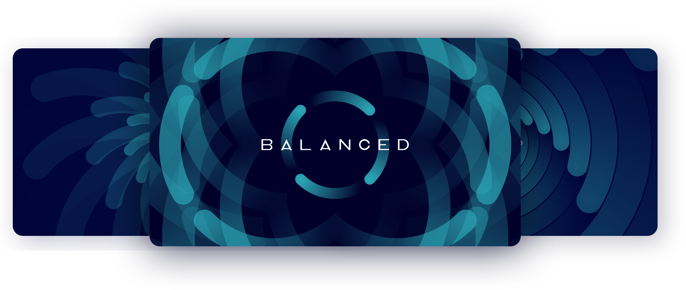
Enjoy the Balanced brand in any setting with a collection of wallpapers for your device. A new design will be added each month.
